VERA Disease Spread Model Tutorial
One major strategy being promoted in response to COVID-19 is social distancing. Many governments are even utilizing lockdowns to enforce it. The mentioned goal here is to "flatten the curve" - but what does this actually mean? What is going on behind the scenes with the graphs we see being shared?
VERA is a tool developed by the Design and Intelligence Lab at Georgia Tech for building and understanding conceptual models. In light of the current pandemic, we have developed a VERA model for understanding the relationship between social distancing and the spread of a disease.
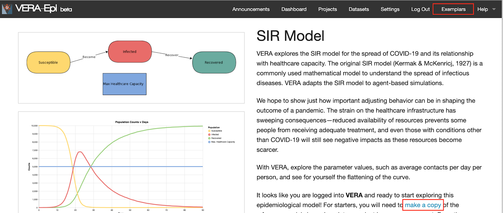
VERA explores the SIR model for the spread of COVID-19 and its relationship with healthcare capacity. The original SIR model (Kermak & McKenricj, 1927) is a commonly used mathematical model to understand the spread of infectious diseases. VERA adapts the SIR model to agent-based simulations.
We hope to show just how important adjusting behavior can be in shaping the outcome of a pandemic. Strain on the healthcare infrastructure has sweeping consequences - reduced availability of resources prevents some people from receiving adequate treatment, and even those with conditions other than COVID-19 will still see negative impacts as these resources become more scarce.
With VERA, you can explore parameter values and see for yourself the flattening of the curve.
Interested in learning more? Follow the below tutorial to work with the model yourself!
Getting Started
To get started, click "Sign Up" at the top of the screen to make an account, or log in with an existing account.
Once this is done, click on the "SIR Model" You will see the detailed model description, expected simulation results, and the suggested usage in VERA.
Please "copy the model" by clicking the text under a new project or an existing project.
The Model Editor
Welcome to the VERA model editor! There are four main pieces.
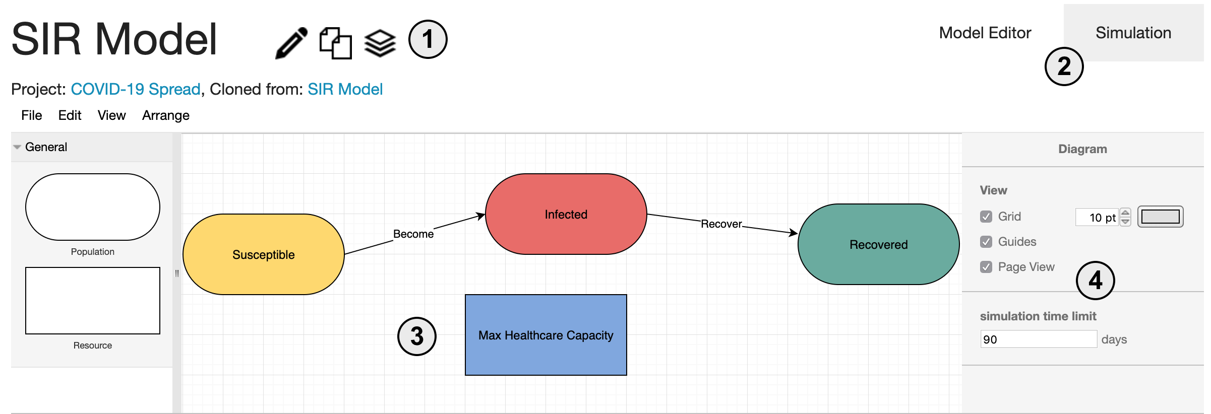
- 1. The model name as well as options to edit the name, make a copy, or archive the model
- 2. The tabs allow the user to switch back and forth between the model editor and the simulation view
- 3. The center of this window is the workspace for building and editing models
- 4. The sidebar is the property editor. Here, different properties of the model are shown depending on what is selected. When nothing is selected, model-wide properties are shown.
Try clicking on a component to look at its properties. Select the "Become" edge and look at the property editor. You should see two simulation parameters:
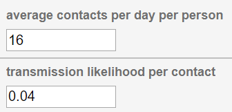
"Average contacts per day per person" describes how many people the average person is coming in contact with on a given day in this simulation. "Transmission Likelihood" describes the probability of the disease transferring from an infected person to a susceptible person that they have come in contact with.
These parameters already have some initial values set.
The Simulation View
Let's see the impact this has on a sample population of 10,000 people. Navigate over to the "Simulation" tab, where we see the following interface.
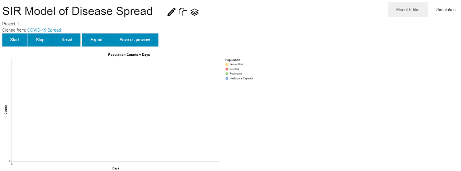
The buttons at the top provide mechanisms to control the graph below. Click "Start" to run the simulation and see the results. This fills in the graph where each component in the conceptual model gets translated to a series in the graph with the same color.
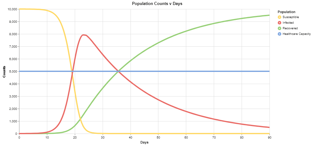
For the default values, you should see the following output:
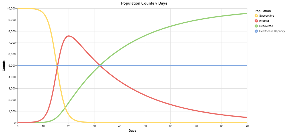
The red series corresponds to the number of infected individuals, and we can see that under these conditions, it exceeds the healthcare capacity of the system very early on in our simulation.
Changing the Parameters
Now that we've seen one set of results, let's flip back to the modeling tab and try to change a parameter. Clicking on the "Become" edge, let's change the "Average contacts per day per person" to 12 instead of 16. In this hypothetical scenario, people are reducing social contact somewhat, but not substantially.
Switching back over to the simulation view, we can run this again to see the results:
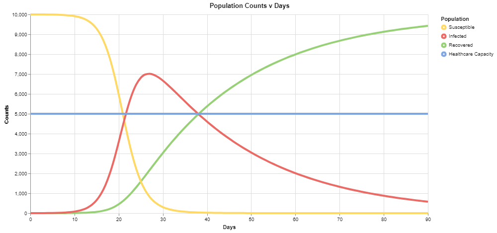
Compared to the prior graph, notice the peak here is closer to 7,000 than 8,000, and healthcare capacity is exceeded after 20 days in the simulation, rather than around 15 days - a step in a positive direction.
What's Next?
We have covered the basics of the VERA interface and provided a sample problem of adjusting a parameter, but we have only scratched the surface of what is possible here. To start, experiment with other values of "Average contacts per day per person" until you find a scenario where infections do not exceed healthcare capacity.
There are other parameters in the simulation as well. Consider the initial populations of the different groups, found by clicking on the components. Here we are modeling a pandemic at the onset with a population of 10,000 people. You can customize the populations of the different components to look at other population sizes or start from different stages - maybe 1,000 people are already infected at the start rather than just 1 in your simulation. As shown above, we also have the "transmission likelihood" and "average recovery time" - you can vary these values as well to visualize the effects of other strategies, such as a society-wide effort to reduce transmission likelihood (wearing masks, washing hands, etc.). The model-level property "simulation time limit" can be used to view results in a longer frame of time.
Learn More: the Model Built from Data
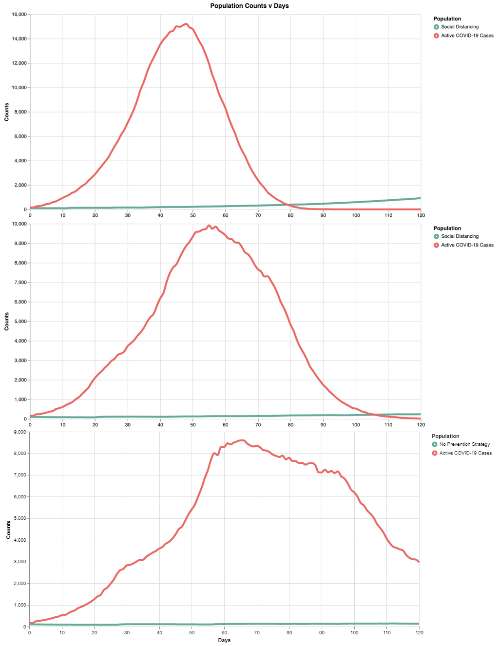
Now that you have explored the theoretical SIR model in VERA, let’s explore the empirical model with real-world datasets. We built a model using the VERA ML model builder off the actual dataset provided by Johns Hopkins University to model the spread of COVID-19. Specifically, the 10 day span from March 5th to March 14th was taken to build the models. The following models form a series of increasingly intense social distancing strategies.
Model 1: Light Social Distancing
In the "Exemplars" page, copy on the "COVID-19 Light Social Distancing" model.
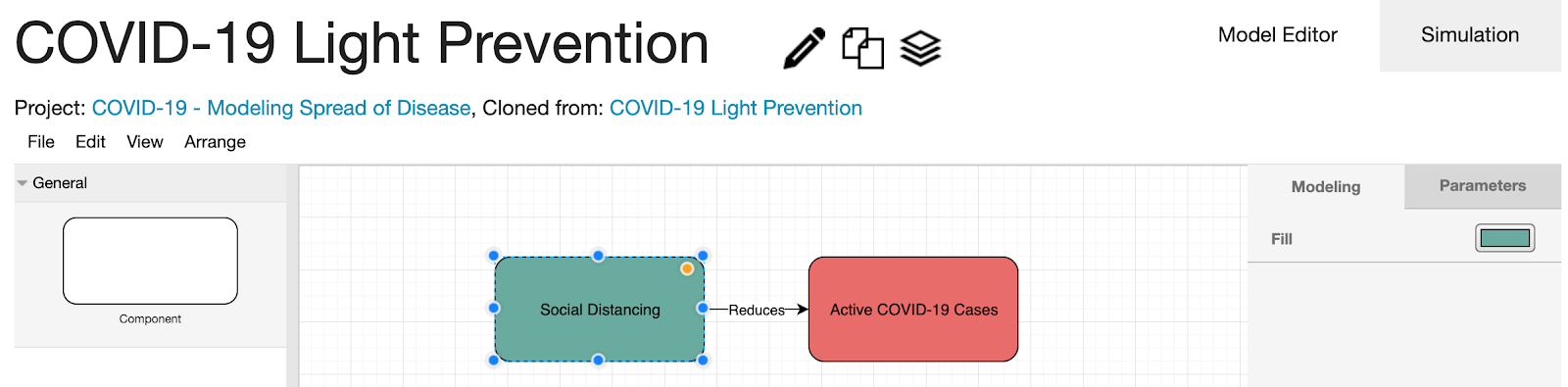
Here, the rapid spread is combated with light social distancing. The simulation parameter values of the "Active COVID-19 Cases" component in the right panel were filled automatically by applying machine learning techniques on the imported dataset.
Switching over to the simulation view, we can run this to see the results:
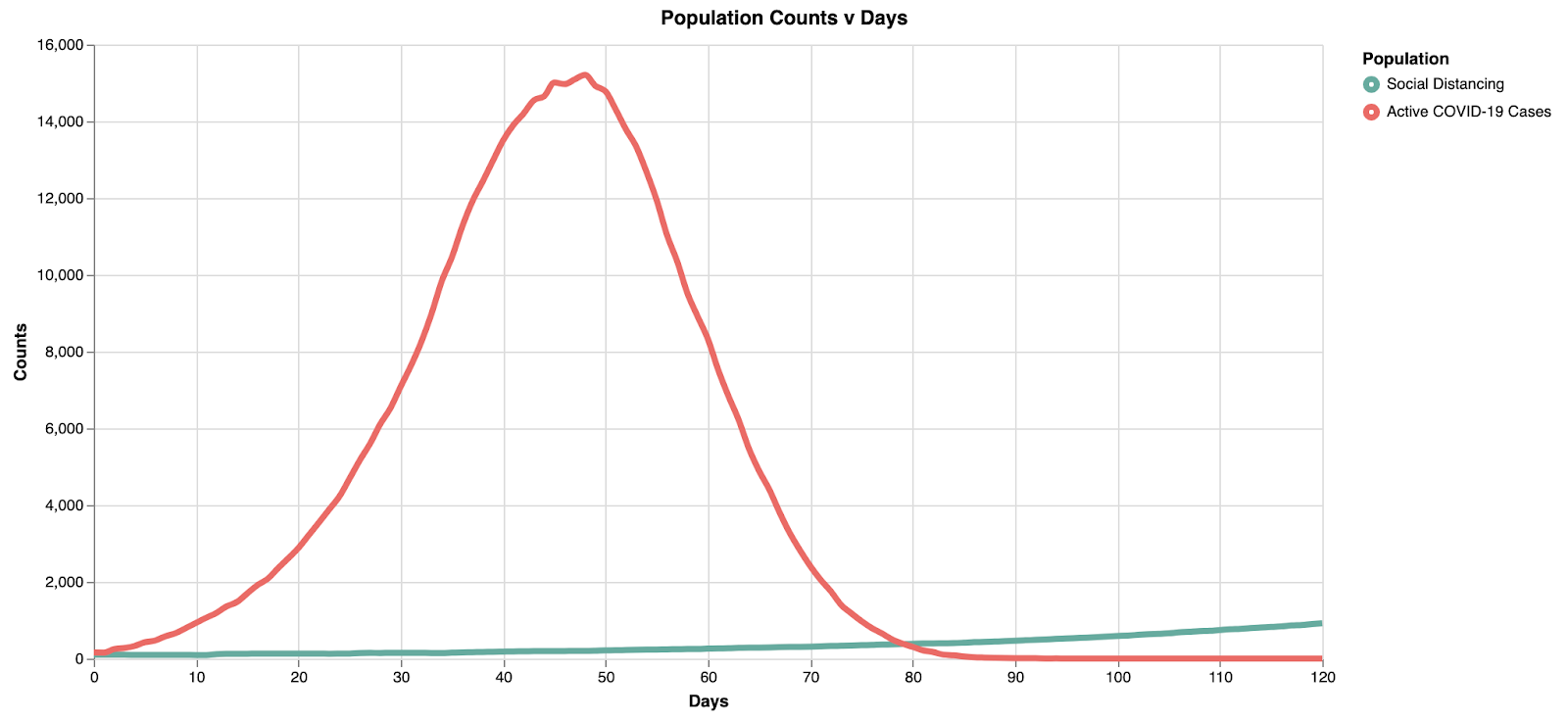
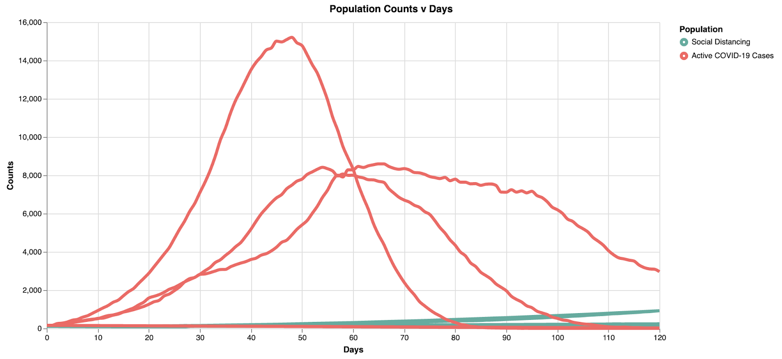
Note here the peak is at ~15k in ~45 days. With the light social distancing, the infection rate starts to slow down after ~50 days.
Model 2: Moderate Social Distancing
Now that we’ve seen one set of results, let’s flip back to the modeling tab and try to change some parameters. We’re going to decrease how often they interact by changing “adoption/transmission interval,” and decrease the amount of interactions an individual has by changing “interaction probability.” In this hypothetical scenario, social distancing is intensified by the reduction in how often and how much interaction people have with one another. Clicking on the "Social Distancing" component, let's change the "adoption/transmission interval" to 21 instead of 12. Clicking on the "Reduces" edge, let's change the "Interaction probability" to 0.75 instead of 0.5.
Alternatively, you can refer to the "COVID-19 Moderate Social Distancing" model where the parameter changes are already made in the "Exemplars" page.
Switching to the simulation view, we can run this to see the results:
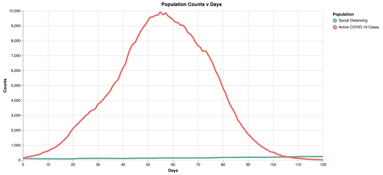
Model 2 shows a "middle ground" representation, where we can begin to see the curve flattening. However, the max active cases at any one time decreases (~10k) and the peak is similarly pushed back to about 55 days, providing additional time for resource allocation.
Model 3: Flattening the Curve
Let's flip back to the modeling tab and try to flatten the curve. We’re going to decrease how often they interact by changing “adoption/transmission interval,” and decrease the amount of interactions an individual has by changing “interaction probability.” In this hypothetical scenario, social distancing is intensified by the reduction in how often and how much interaction people have with one another. Clicking on the "Social Distancing" component, let's change the "adoption/transmission interval" to 28 instead of 21. Clicking on the "Reduces" edge, let's change the "Interaction probability" to 0.84 instead of 0.75.
Alternatively, you can refer to the "COVID-19 Flattening the Curve" model where the parameter changes are already made in the "Exemplars" page.
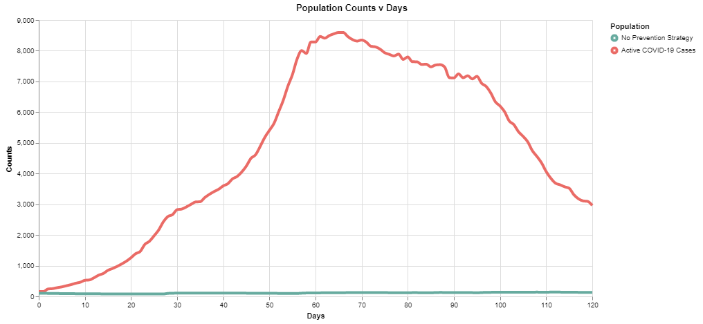
By flattening the curve with intense social distancing, we reduce the overall stress on the healthcare infrastructure. Note here the peak is at ~8.5k in ~65 days. Not only does the curve get wider (flatter), but the absolute peak cases decrease with increased social distancing.
Playing with data
Modeling and simulation become more powerful when coupled with data. VERA allows users to import their own datasets and use them to improve their models using machine learning techniques. Import any datasets to visualize them and use them to better fit your models!
Importing the dataset
- To import the dataset, click "datasets" from the top menu bar.
- Click on “add datasets.”
- Choose a file to upload. Remember the file type has to be .csv.
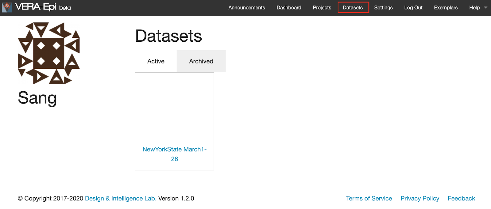
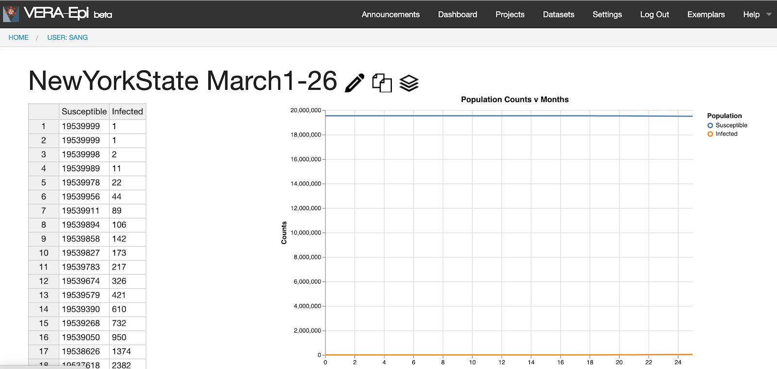
- To view the dataset, click on “NewYorkState March1-26.” This data represents the populations of the susceptible and the infected from March 1 to March 26, 2020 in New York, provided by Johns Hopkins University.
- The data is presented in the left table where you can edit the data.
- The graph visualizes data as shown in the right line graph. The X axis represents time in “days,” and the Y axis represents the population size. Each component is represented with different colors. Note that the susceptible population is expressed with blue line whereas the infected population is expressed with orange line.
Fitting to data
You can use the dataset to compare with your model, and VERA suggests revised parameter values that better fit the data.
To start, go to your project and select the model that you want to compare.
If you don’t have a model to compare, go to "Exemplars" from the top menu bar, and select and copy the “SIR model.”
- Once you copy the model, it will take you to the model editor page. Click “Simulation” next to “Model Editor.”
- Click “Reset” and then “Start” to start the simulation.
- If you want to make this graph better fit the actual model, click “Fit to Data” as highlighted with the red box below.
- Then select the dataset you want to compare. In this scenario, click “NewYorkState March1-26” to make this graph better represent the disease spread in New York.
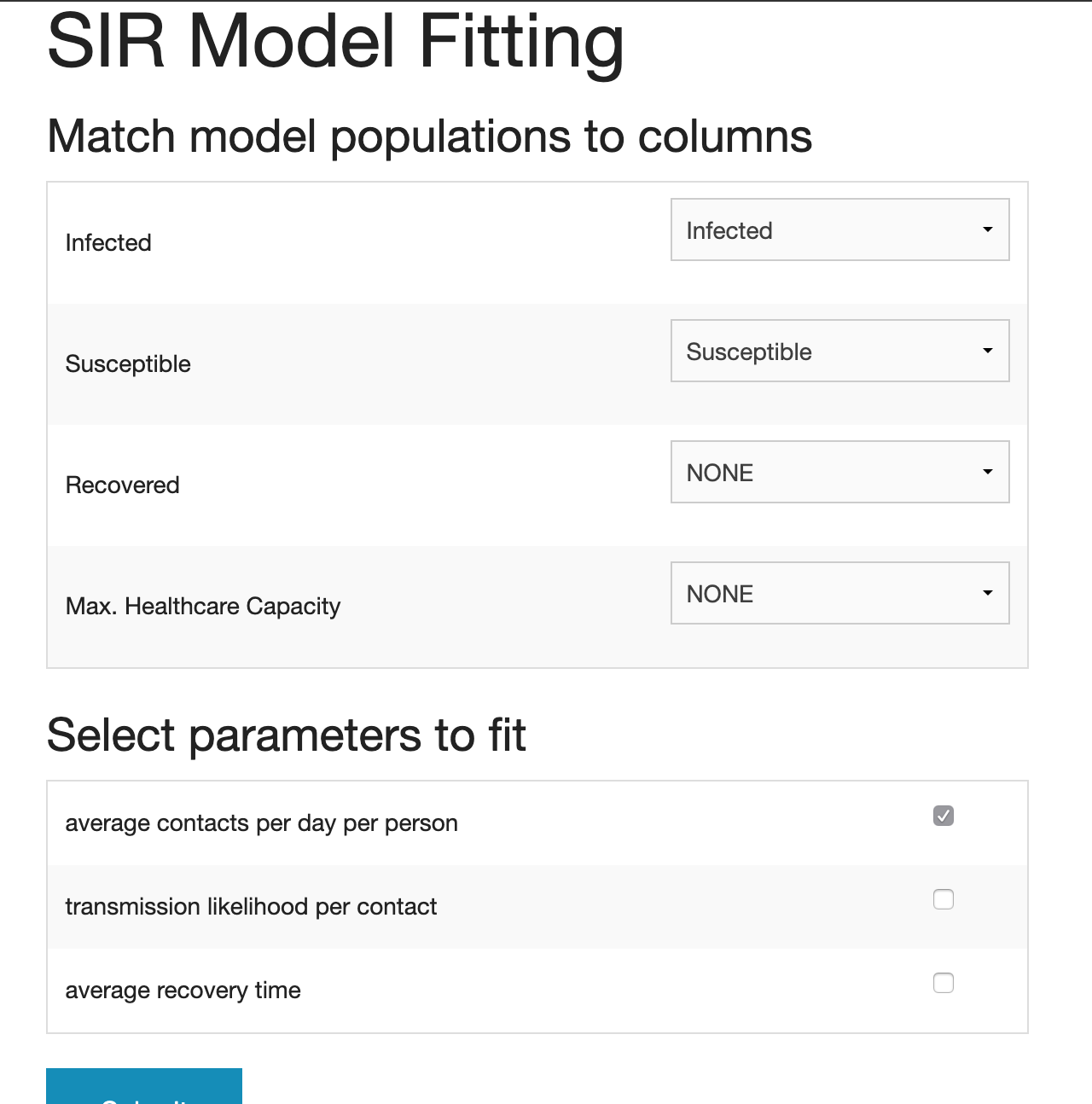
- VERA asks you to match the components in the model with the ones in the datasets as the names of components may vary.
- The component names on the left represent the component names in the model. If there is no matching name in your datasets, select “NONE.”
- Then you select the parameters to fit. In this scenario, we are going to fit “average contacts per day per person” to better understand the social distancing level in New York.
- Click “Submit.” Please note that this may take some time to process.
- The result page will look like this.
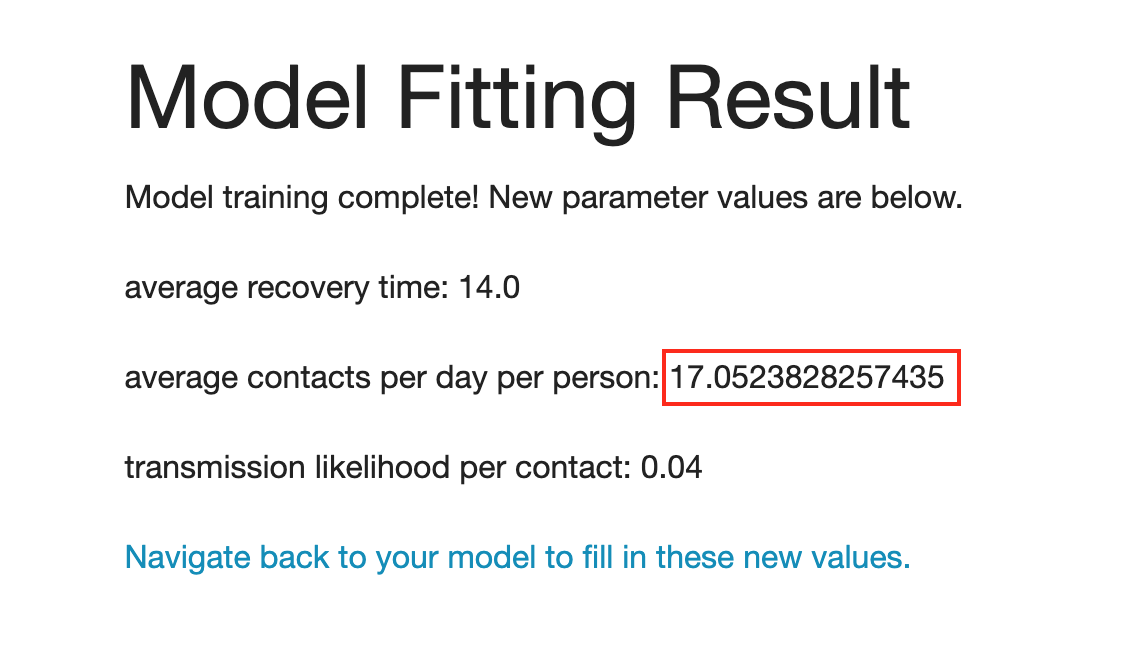
- The suggested parameter value for “average contacts per day per person” is 17.05.
- The default value of “average contacts per day per person” before modeling fitting was 16. This means the model needs to have a higher number of interactions (which is less social distancing) to resemble the disease spread in New York.
- Please note that other parameters “average recovery time” and “transmission likelihood per contact” remain intact because those were not selected in the previous step.
- To apply this change to your model, click “Navigate back to your model to fill in these new values.”
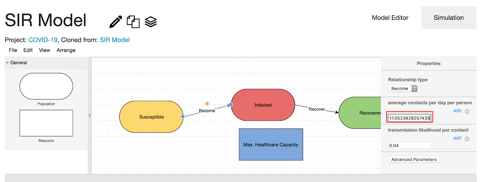
- Click the “become” edge to see if the suggested change is applied to your model. The “average contacts per day per person” was changed from 16 to 17.05.
- Click “Simulation” to see how simulation results are changed.
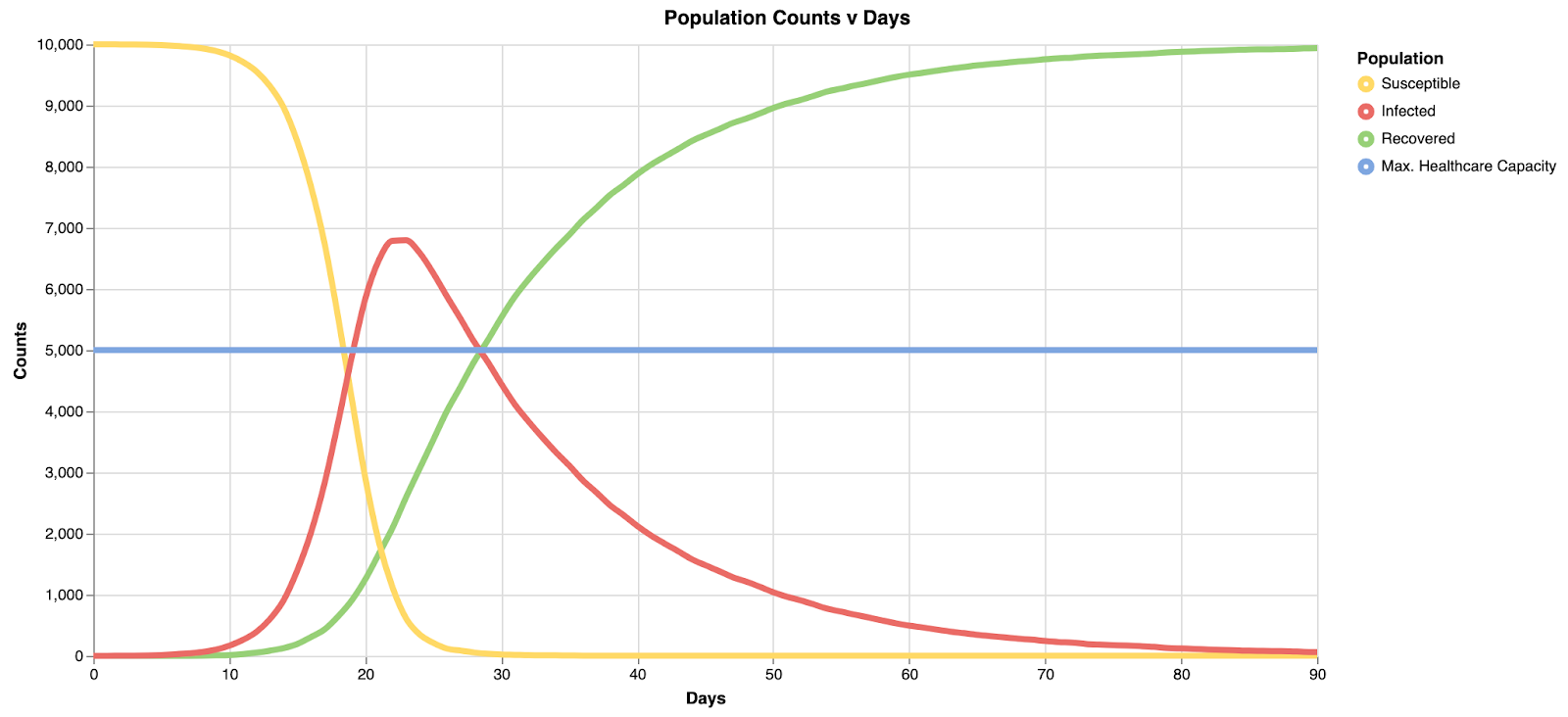
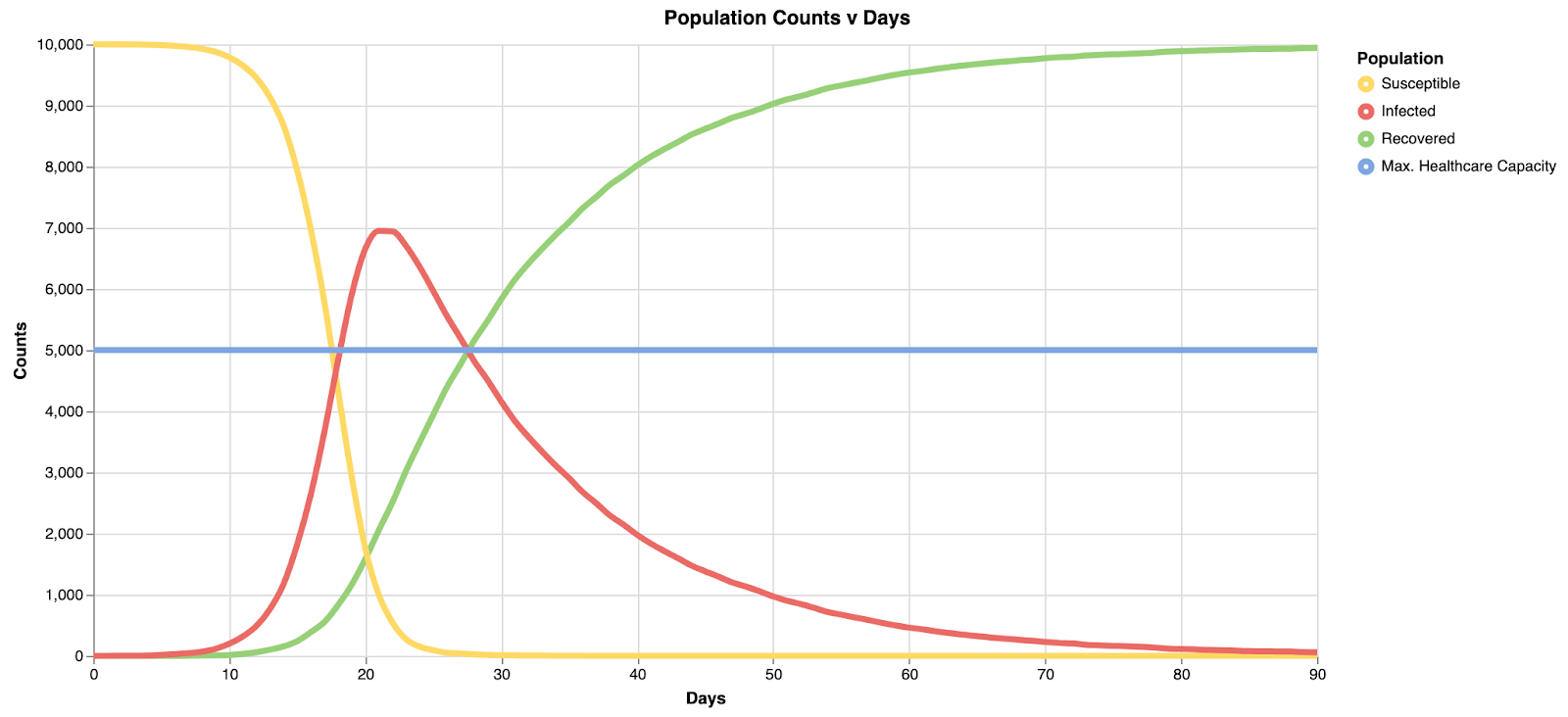
Compare two graphs: the graph with the default values (top) and the graph with the modified values (bottom). Notice that the peak has shifted a little bit to the left. The first graph reaches its peak after ~22 days. The second graph reaches its peak after ~20 days.
Data format
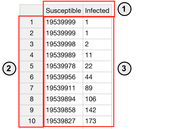
- See the sample dataset above.
- The data has to be in csv format.
- The column represents a component. In this scenario, there are two components: susceptible and infected.
- Each row is counted as a day. You don’t need to specify the number for this.
- The row represents a population size. In this scenario, the infected population is 1 in day 1 and 2 and becomes 2 in day 3.
- The first row should be composed of components’ names. From the second row, each row represents the population size of each component (column).
Conclusion
We hope you have enjoyed this walkthrough of our disease spread model constructed in VERA. We have seen that flattening the curve by practicing social distancing 1) decreases peak cases, and 2) gives more time for healthcare response. Please keep in mind that the goal of this model is to illustrate conceptual relationships, not to make any scientific claims about the actual spread of COVID-19. Thus, all resultant values should not be viewed as predictions of the future, but indicators of Epidemiological trends. This model is based on the SIR (Susceptible-Infected-Recovered) model of disease spread. If you are interested in learning more about models in Epidemiology, see the link in the "References" section below for the Wikipedia article on the SIR model and its variants. Social distancing is just one aspect in fighting COVID-19, though it has been effective in reducing the rate of spread where it has been carried out to a major extent (McCurry et al., 2020).
The original version of VERA focused on ecological modeling, though it is powered by general purpose modeling and simulation engines.The development of the original version of VERA was supported by an NSF BigData grant. We thank Robert Bates (Veloxicity), Dr. Jennifer Hammock (Encyclopedia of Life, Smithsonian Institution), and Dr. Emily Weigel (School of Biological Sciences, Georgia Tech) for their contributions to the VERA project.
References
- Compartmental models in epidemiology. Wikipedia. https://en.wikipedia.org/wiki/Compartmental_models_in_epidemiology
- McCurry, J., Ratcliffe, R., & Davidson, H. (2020) Mass testing, alerts and big fines: the strategies used in Asia to slow coronavirus. The Guardian, 11 March, 2020. Available at: https://www.theguardian.com/world/2020/mar/11/mass-testing-alerts-and-big-fines-the-st rategies-used-in-asia-to-slow-coronavirus.